While the Form plugin does one thing, and does it very well, jQuery UI
does a wide variety of things (and does them well). In fact, jQuery UI
is not so much a plugin, but rather a whole library of plugins.
Led by Paul Bakaus, the jQuery UI team has created a number of core interaction components and full-fledged widgets
to help make the web experience more like that of a desktop
application. Interaction components include methods for dragging,
dropping, sorting, and resizing items. The current stable of widgets
includes an accordion, date picker, dialog, slider, and tabs, with
quite a few more in active development. Additionally, jQuery UI
provides an extensive set of advanced effects to supplement the core
jQuery animations.
Since the full UI library
is too extensive to adequately cover within this chapter, we'll limit
our exploration to UI effects, the Sortable core interaction component,
and the Dialog widget. Downloads, documentation, and demos of all
jQuery modules are available at http://ui.jquery.com/.
Effects
The effects module of jQuery UI
comes with a core file and a set of individual effect files. The core
file provides animations for colors and classes, as well as advanced
easing.
Color animations
With the core effects file referenced in the document, the .animate() method is extended to accept additional style properties, such as borderTopColor, backgroundColor, and color. For example, we can now gradually change an element from black text on white background to white text on black background:
$(document).ready(function() {
$('#mydiv').animate({
color: '#fff',
backgroundColor: '#000'
}, 'slow');
});
A little more than halfway through the animation, the<div> looks like this:

The element looks exactly as it should, with the text on its way to becoming white and the background color approaching black.
Class animations
The three class methods that we have worked with in previous chapters—.addClass(), .removeClass(), and .toggleClass()—now take an optional second argument for the animation duration. We can now write them as .addClass('highlight', 'fast') or .removeClass('highlight', 'slow') or .toggleClass('highlight, 1000).
Advanced easing
Advanced easing functions vary the speed and distance at which transitions occur at various points along the way. For example, the easeInQuart
function ends an animation at four times the speed at which it started.
We can specify a custom easing function in any of the core jQuery
animation methods or jQuery UI effect methods. This can be done by
either adding an argument or adding an option to an options map, depending on the syntax being used. For example, specifying the function for our previous color animation can be done with an additional argument: easeInQuart
$(document).ready(function() {
$('#mydiv').animate({
color: '#fff',
backgroundColor: '#000'
}, 'slow', 'easeInQuart');

});
Or, it can be done with an option added to a second options map:
$(document).ready(function() {
$('#mydiv').animate({
color: '#fff',
backgroundColor: '#000'
}, {
duration: 'slow',
easing: 'easeInQuart'
});
});
Demonstrations of the full set of easing functions are available at http://gsgd.co.uk/sandbox/jquery/easing/.
Additional effects
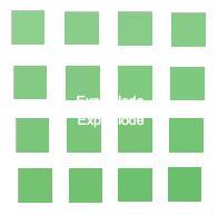
The individual effect files add various transitions, all of which can be implemented with the .effect() method and some of which extend the functionality of jQuery's, and .toggle() methods as well. For example, the explode effect, which hides elements by exploding them into a given number of pieces, can be achieved with the .effect() method: .show(), .hide()
$(document).ready(function() {
$('#explode').effect('explode', {pieces: 16}, 800);
});
Or, it can be achieved with the .hide() method:
$(document).ready(function() {
$('#explode').hide('explode', {pieces: 16}, 800);
});
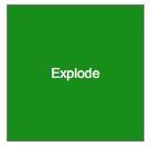
Either way, the effect hides a box that begins like this:
In the middle of the animation, it looks like this:
And at the end of the animation, the box is hidden.
Interaction components
Among the jQuery UI interaction components is Sortable,
which can transform just about any group of elements into a
drag-and-drop style list. Here, we have an unordered list with some CSS
styles applied to each item:
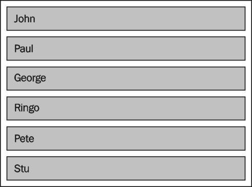
The HTML is pretty straightforward:
<ul id="sort-container">
jQuery UI plug-in libraryinteraction components<li>John</li>
<li>Paul</li>
<li>George</li>
<li>Ringo</li>
<li>Pete</li>
<li>Stu</li>
</ul>
Now, to make the list sortable, we simply write the following code:
$(document).ready(function() {
$('#sort-container').sortable();
});
This single line within the $(document).ready() allows us to drag each item and drop it into a different position within the list.
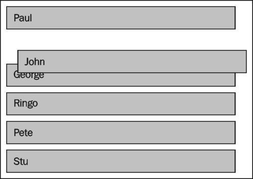
We can enhance the user interaction by adding options to the .sortable() method. While this method has over thirty available options, we'll use just a few for our example:
$(document).ready(function() {
$('#sort-container').sortable({
opacity: .5,
cursor: 'move',
axis: 'y'
});
});
The first two options, opacity and cursor, are self-explanatory. The third, axis, limits the element's movement to a particular axis (in this case, the y-axis) while being sorted.
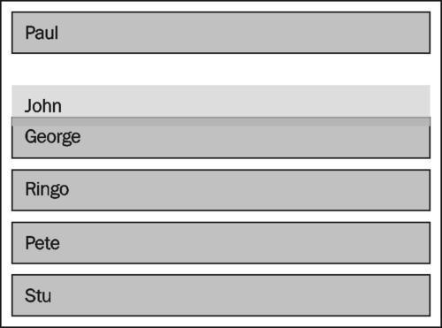
As is evident by the
lighter background color of the sorted element, we've also taken
advantage of a class that is automatically applied to it, ui-sortable-helper, by applying styles to the class in our stylesheet.
For more information about all of the jQuery UI core interaction components, visit http://docs.jquery.com/UI#Interaction.
Widgets
In addition to building-block components, jQuery UI includes a handful of robust user-interface widgets
that appear and function "out of the box" like the full-fledged
elements we are accustomed to seeing in desktop applications. The Dialog widget, for example, uses the draggable and resizable components to produce a dialog box, so that we don't have to build our own.
As with other UI widgets, Dialog accepts a large number of options. Its aptly named .dialog() method can also take string arguments that alter what the dialog does. At its most basic level, the .dialog()
method converts an existing element into a dialog and displays it,
along with the element's contents. For instance, we can start with a
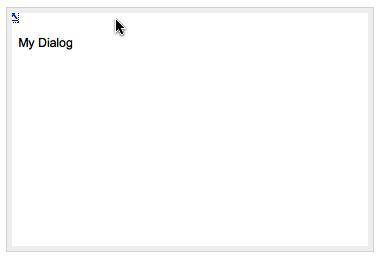
simple<div> structure.
<div id="dlg">My Dialog</div>
Unsurprisingly, this<div> looks quite plain—a simple text block:

We can invoke the basic dialog in our JavaScript file as soon as the DOM is ready.
$(document).ready(function() {
$('#dlg').dialog();
});
The text is now wrapped in a dialog box:
This dialog box can be resized
by clicking on one of its borders and dragging. It can be moved by
clicking anywhere within the top area of the dialog, just below the top
border. And, it can be closed by clicking on the X link in the upper-right corner.
We can obviously do a lot
better with the styling, though. While jQuery UI provides a minimal set
of styles to ensure that widgets are functional, it leaves decisions
about look and feel up to us. Here is a dialog with a default theme applied:
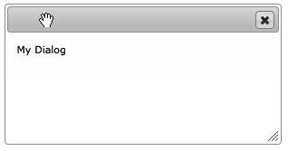
Now, the various areas are
clearly indicated, and the mouse cursor changes to provide even more
visual feedback on the parts of the dialog enabled for dragging and
resizing.
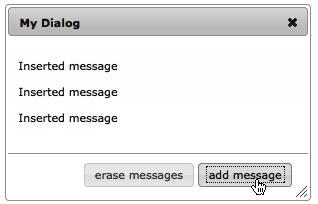
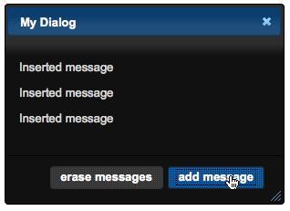
As with the other jQuery UI methods, .dialog()
comes with a number of options. Some of the options affect the dialog's
appearance while others allow events to be triggered. Here is a
sampling of these options:
$(document).ready(function() {
jQuery UI plug-in library.dialog() method options, samplingvar $dlg = $('#dlg');
var dlgText = $dlg.text();
$dlg.dialog({
autoOpen: false,
title: dlgText,
open: function() {
$dlg.empty();
},
buttons: {
'add message': function() {
$dlg.append('<p>Inserted message</p>');
},
'erase messages': function() {
$('p', $dlg).remove();
}
}
});
$('#do-dialog').click(function() {
$dlg.dialog('open');
});
});
The many other options for configuring the display and behavior of dialogs can be found at http://docs.jquery.com/UI/Dialog/dialog#options.
jQuery UI ThemeRoller
A recent addition to the jQuery UI library is the ThemeRoller,
a web-based interactive theme engine for UI widgets. The ThemeRoller
makes creating highly customized, professional-looking elements quick
and easy. As we noted, the dialog that we just created has the default
theme applied to it; this theme will be output from the ThemeRoller if
no custom settings are supplied.
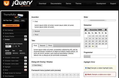
Generating a completely different set of styles is a simple matter of visiting http://ui.jquery.com/themeroller/, modifying the various options as desired, and pressing the Download This Theme button. A .zip
file of stylesheets and images can then be placed in the appropriate
directory. For example, by choosing a few different colors and
textures, we can within a few minutes change our previous dialog to
look like this: